INTRODUCTION
The Problem
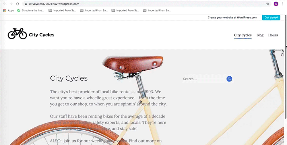
Ultimately, users discover that in order to reserve a bike, you have to send City Cycles an email. This "frustrating" and "confusing" process led to fewer bike rentals and an increase in customer phone traffic.
My UX Role
1. Conducting both qualitative and quantitative UX research
2. Ideating solutions for the users’ problems or pain points
3. Improving City Cycles information architecture for their sitemap and navigation
4. Creating wireframes and interactive prototypes
5. Conducting usability testing
QUALITATIVE AND QUANTITATIVE UX RESEARCH
My qualitative research began by empathizing with the user. I conducted several interviews with users after they attempted to make a reservations using the City Cycles website. There was a lot of confusion and frustration. Here were the major pain points:
• Users describe having to "hunt" for any information. They expected to see a button or prompt on the main navigation menu for renting a bike, but there wasn't one. One user asked, "Are they trying to discourage me from renting a bike?"
• Users also found the reservation experience itself confusing, annoying, and misleading. They anticipated an automated process with a confirmation, similar to renting a hotel room or car online. Instead, they had to write an email to request a reservation. One user joked, "Hey, City Cycles! The 90s just called, they want their website back!"
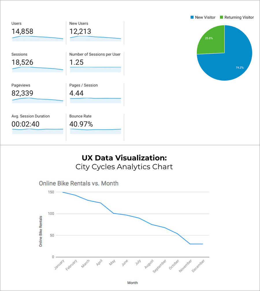
Using Google Analytics, I studied the City Cycles website user data. Here's what I discovered:
• The data showed a steady decrease in online rentals, month over month
• It also detailed the number of new visitors (74.2%) versus return visitors (25.8%), and a bounce rate of nearly 41%. Yikes...
INTERPRETING & APPLYING THE DATA
Both the qualitative and quantitative data revealed a problem with the City Cycles navigation and reservation process. Users expressed their many frustrations during interviews. The Google Analytics data revealed few returning visitors to the site and steadily declining online rentals.
Applying the Data
Using site analytics, surveys, observations, and user interviews, I created both a user persona and a journey map to better help empathize with City Cycle users and create an improved "user-centric" experience.

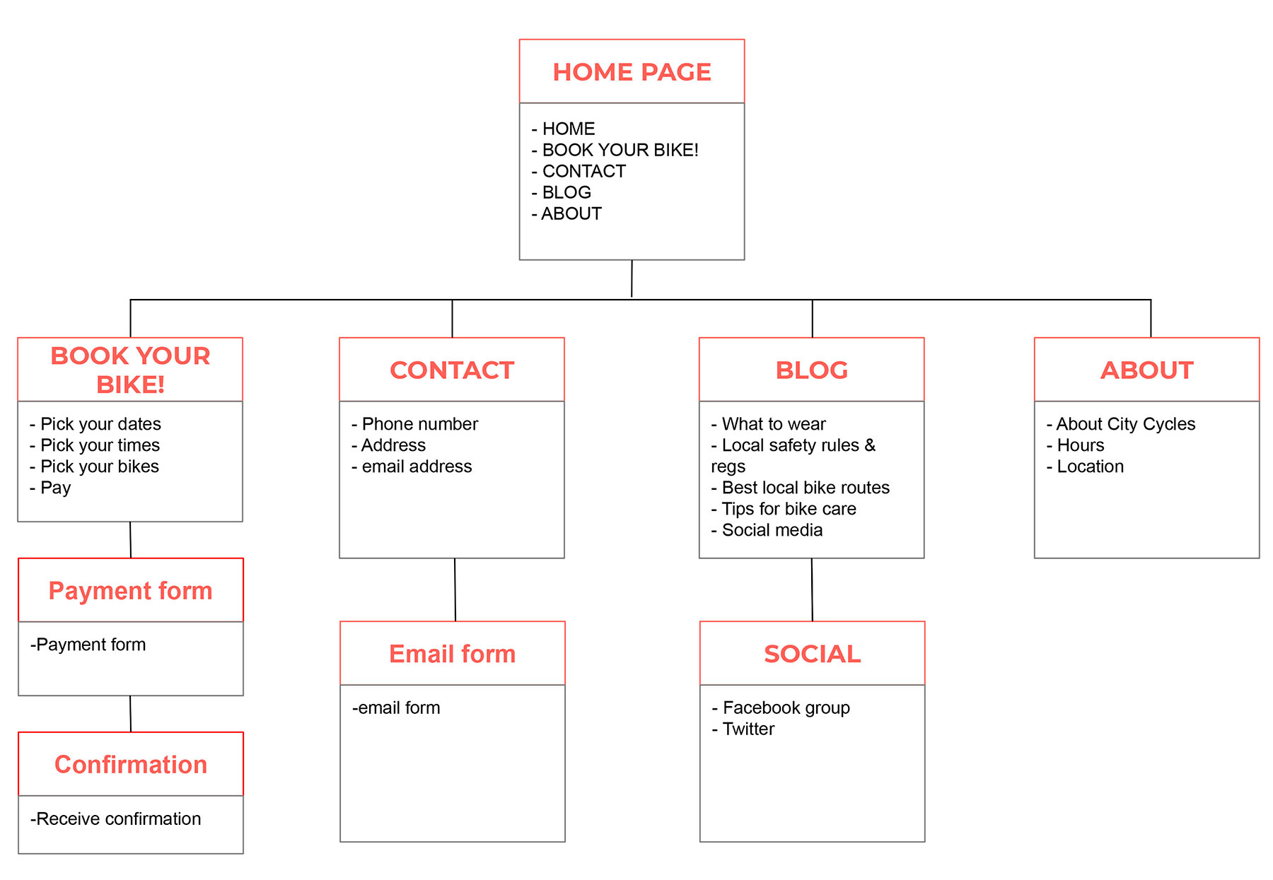
IMPROVING CITY CYCLE'S INFORMATION ARCHITECTURE
The qualitative research revealed that users struggled to find an easy way to start the reservation process. The navigation menu needed a large, clearly marked button or link added to start the reservation process, reduce confusion and ultimately increase online rentals.
The research also illustrated the need for an automated online reservation process, that didn't require users to call, write, or visit the shop to confirm a reservation.
• Paper, pen & pencil
• Figma
• Invision
• HTML/CSS
• Adobe Creative Suite
• Mood Boards/Competitors Research
Inspiration
I created a bicycle lovers mood board for inspiration as the first step in this process. Its purpose is to transfer the right mood and bring the emotions expected from this service.

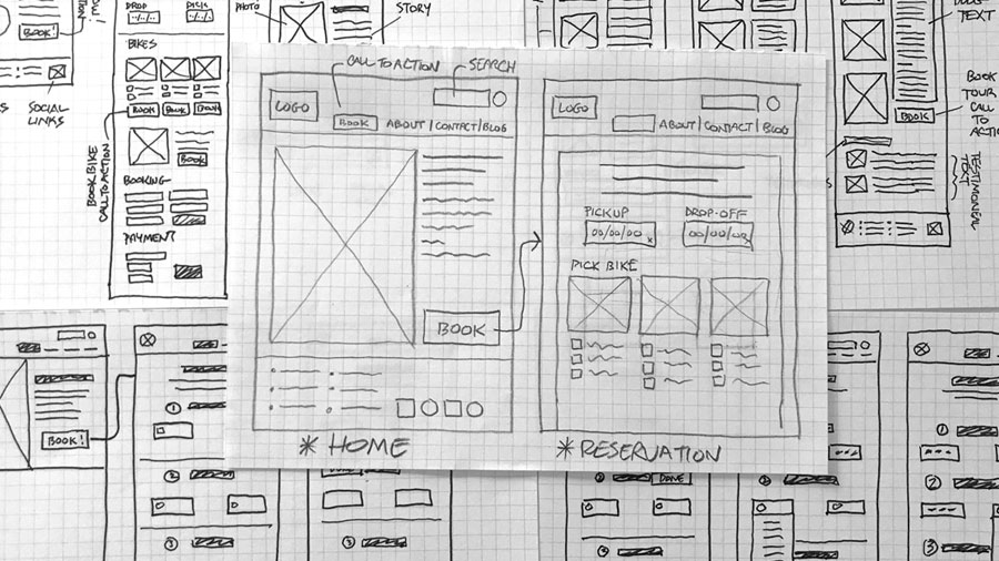
I began iterating by hand sketching a number of wireframe layouts and configurations. My research illustrated the need for a large, clearly marked reservation button or link added to the main navigation menu. I added one (as a large button) to the main navigation menu. I also added an even larger button to the homepage just below the main header and intro text.
I then begin to think about the more detailed procedure involving the new and improved reservation process.
The process needed to be fast, easy, and intuitive. My approach was to walk the user through the process step-by-step. They can choose the day, time, and type of bike they want to rent, without ever contacting the shop directly.
A logical user flow was developed that takes the user through the reservation process step-by-step.
A refined and highly detailed user flow, using high-fidelity wireframes, was developed that included every step needed to complete the reservation.
A high-fidelity prototype was built that takes a user from the homepage through the improved reservation process.
Click here to try the reservation process prototype.

Validation Testing
To test the new City Cycles website user experience, I surveyed 4 different users and asked them to perform a few predefined tasks on the website as I recorded their actions and took notes. Some of the tasks/questions were::
• Book a bicycle reservation
• Find the City Cycles store address
• Determine what (if anything) you will need to bring on the day of your reservation
"It was easy to use. Pretty straight forward."
"Not sure how to select my reservation date."
"Big improvement!"
"Very intuitive."
Revisions and Additional User Testing
• The only hurdle was a glitch in the "CHOOSE YOUR DATE" portion of the reservation process. Users needed to click the blue dot on the selected day in order to fill the date field. 3 of the 4 users had the same experience. They all eventually figured it out, but only after a few trial and error clicking.
• Revisions were made to the "CHOOSE YOUR DATE" portion of the reservation process. A step was eliminated to make the process easier and more intuitive.
• Additional usability testing was conducted on the revised reservation process. 4 out 4 users completed the process successfully.
Lessons Learned
Challenges or Obstacles
I really enjoyed this project! UX Design is a completely new field for me. I loved the process!.
That said, there were challenges. Overcoming my own biases during usability testing was my biggest challenge. My first user struggled with one portion of the reservation process. I assumed that she was the problem, not my prototype. She just didn’t “get it.” When the second and third users also struggled, it made me realize that I should assume nothing. The users decide what works and what doesn’t.
The lessons I learned from this UX project included:
• How UX should be the voice for the user and the advocate for the user’s needs
• How to present high level takeaways to stakeholders
• The underappreciated value of soft skills