INTRODUCTION
Disclaimer: I am not affiliated with Home Improov in any capacity.

The Problem
The Scope
While there are many areas of improvement needed for this app, the main scope of this challenge will be limited to improving the UX/UI of the projects portion of this app.
Personal objectives
1. Facilitate a better user experience for Home Improov's app by improving its UX and UI.
2. Take full ownership of the various roles involved in designing a product such as:
• Conducting qualitative UX research
• Ideating solutions for the users’ problems or pain points
• Reimagining the step-by-step UX to make it easier for users (of all skill levels) to accomplish their DIY tasks
• Creating wireframes and interactive prototypes
• Conducting usability testing
Understanding Home Improov and its Customers
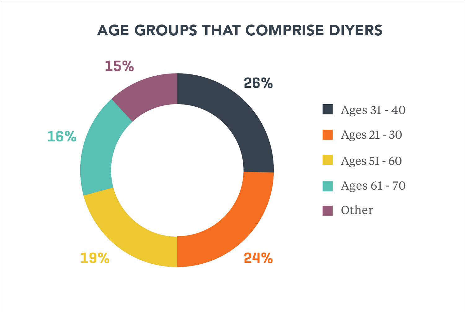
Target Audience Demographics
My quantitative market research revealed surprising data regarding the demographics of DIYers. The DIY Consumer is not limited by age. Although the majority of DIY Consumers fall into the Millennial or young Generation X demographic, older Generation X and Baby Boomers can be DIYers as well. Each of these DIY generations has their own preferences and purchase styles.
The takeaway from this research was that this app has a broader potential demographic user base than originally anticipated.
USER RESEARCH
• What do you like about this app?
• What do you dislike about this app?
• If you could change three things about this app, what would they be?
"The text is way too small!"
"Ugh! I would delete this immediately and go straight to YouTube."
"I need directions that tell me exactly what to do."
"I like the idea of this app, but I don't think they did a good job making it useful for beginners."
"This app assumes I know a lot more than I do."
ANALYSIS
An affinity map is often used to group similar observations together. I used it to surface several key issues common amongst participants.
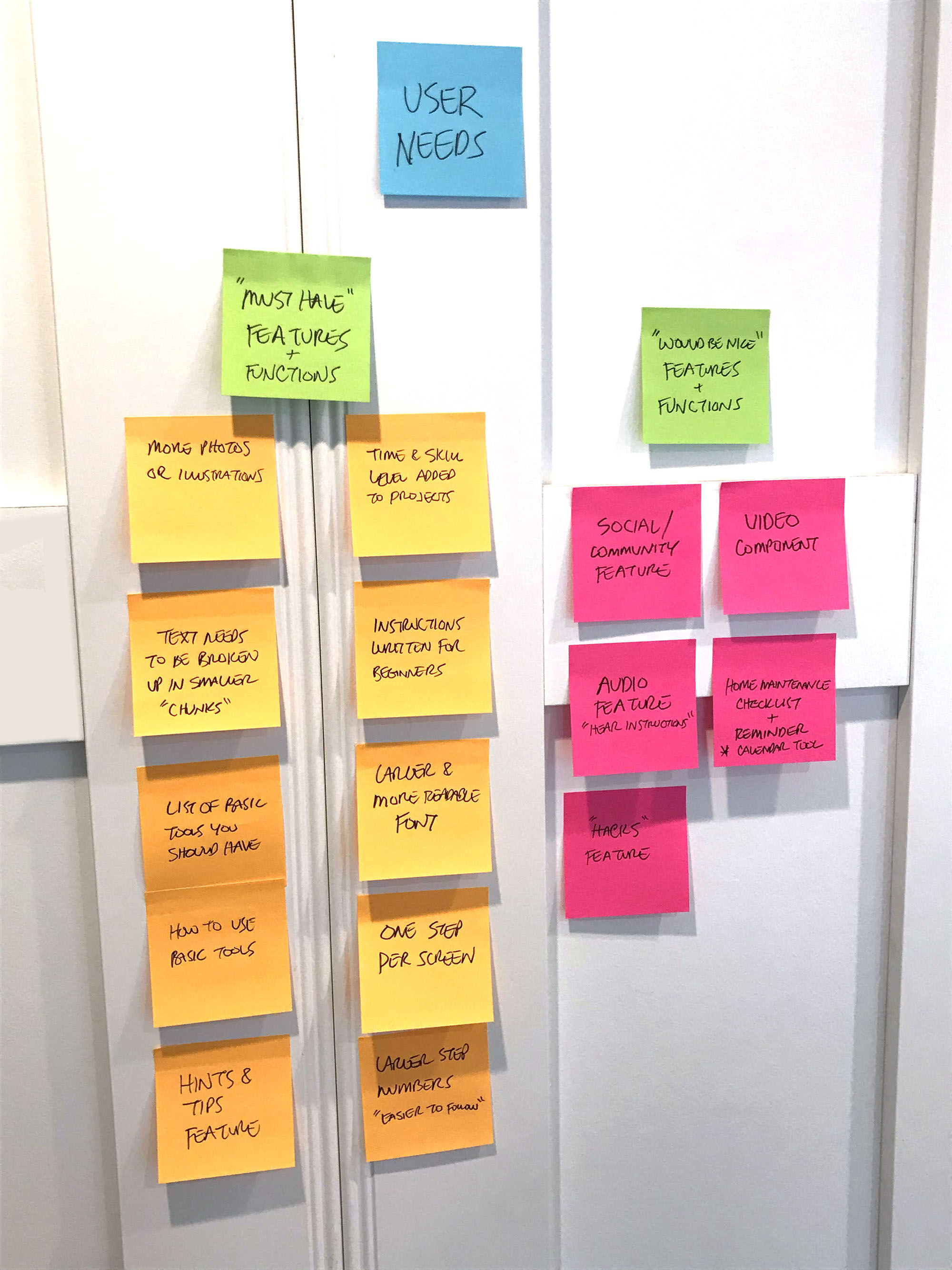

The following four issues stood out the most:
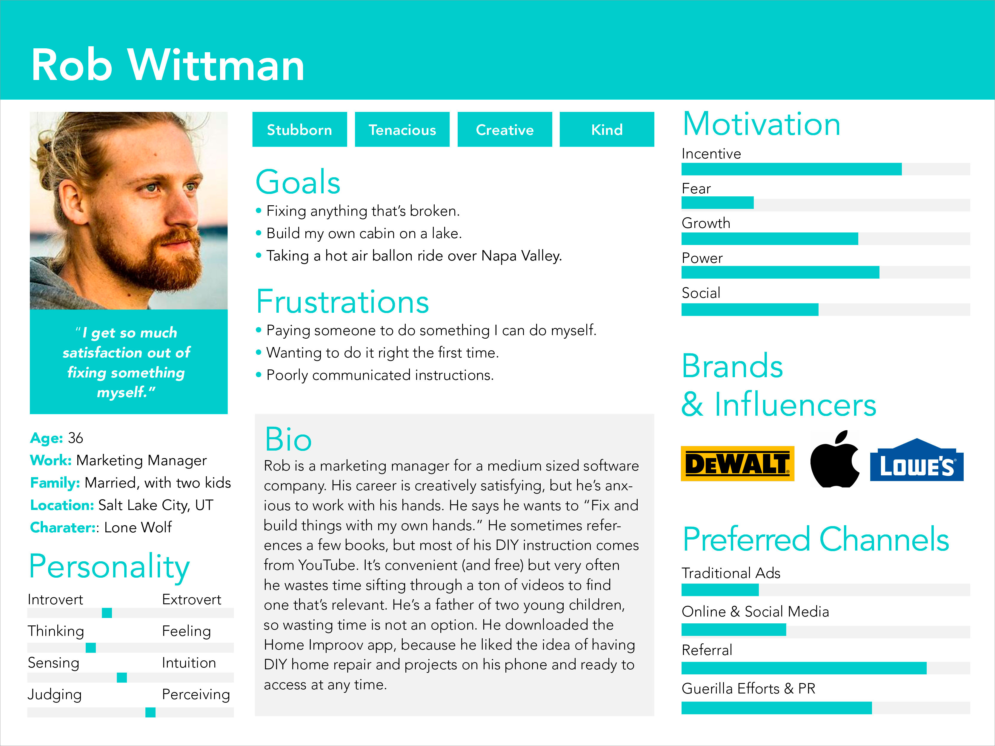
A user persona was created to put a face on Home Improov’s target user and visualize various aspects of their behavior and motivations. This persona was roughly based on DIY market research and user interviews.
• Paper, pen & pencil
• Figma
• Marvel
• HTML/CSS
• Adobe Creative Suite
• Mood Boards/Competitors Research
Inspiration
I created a DIY (do-it-yourself) themed mood board for inspiration as the first step in this process. Its purpose is to transfer the right mood and bring the emotions expected from this service.

I began iterating by hand sketching a number of wireframe layouts and configurations. My research revealed the need for a user-friendly mobile-first interface. The text should be larger and easy to read. Step numbers should be bigger and bolder. Whenever possible, each step should be illustrated and fit on the screen with minimal scrolling.

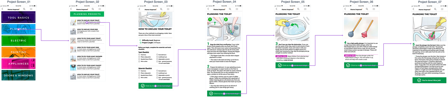
Digital wireframes and a user flow for the new and improved step-by-step process were developed.
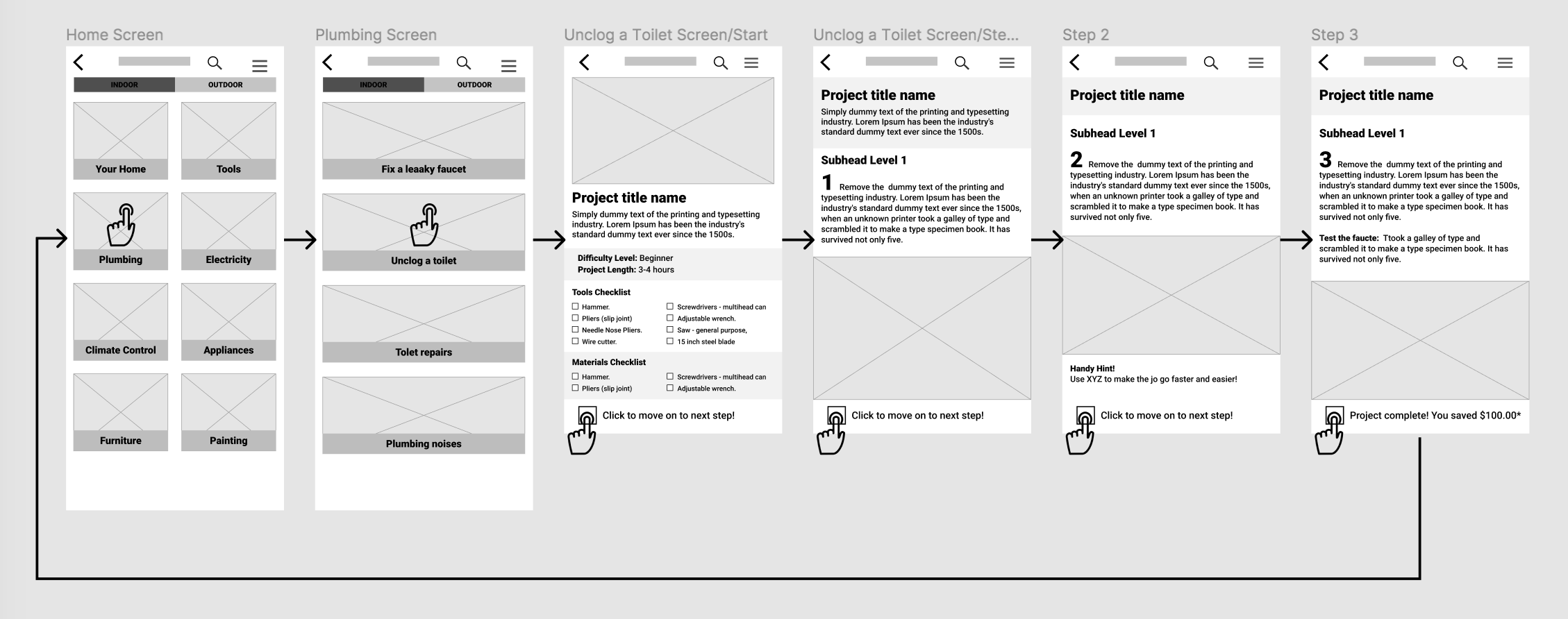
A few features changed between the wireframe hand sketches and digital. Originally, I anticipated ending each step with a check box feature. I also originally had images after the step instructions. I did a round of user research to get feedback. The feedback revealed that most users preferred a CTA (call to action) button to the check box. They also prefered the image before the instructions.

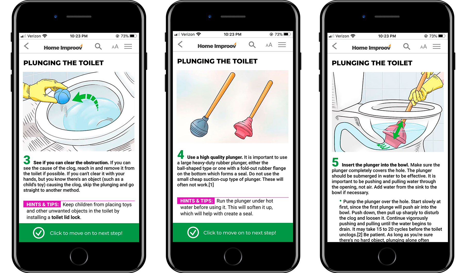
A refined user flow, using high-fidelity wireframes, was developed that included every step needed to complete a sample project. In most cases, there is only one step per screen. The text is larger, bolder, and more readable. In most cases, there is an image to accomapny the corresponding text.
The strategy behind the UI (user interface) was to break up the project into smaller, more colorful, and easier to follow chunks. The new user interface provides the user with a friendlier and more intuitive experience.
A high-fidelity functional prototype was built that takes a user from the homepage through the improved project step-by-step process.
Click here to try the new Home Improov prototype.

Validation Testing
To test the new Home Improov user experience, I surveyed the same four users who tested the original Home Improov app and asked them to review the new project experience.
Here’s what they had to say about the redesign:
"Oh, I like this so much better!"
"This is great! I like that it's so colorful."
"Big improvement!"
"I could actually use this."
Revisions and Additional User Testing
While the user testing for the prototype went well, there was some very useful feedback and suggestions:
• One user suggested that it would be helpful to fix the step image in place so that it's always visible no matter how much text scrolling is necessary.
• Another user said having the option of larger text would dramatically improve their experience.
A new prototype was created that included the two new user suggestions.
• Step images are now fixed so that they're always visible, without having to scroll back and forth between the text and corresponding image.
• Users now have the option to make the text larger if needed for improved readability.
Click here to try the revised Home Improov prototype.
Lessons Learned
Challenges or Obstacles
Deciding which problem to solve was my biggest challenge. The Home Improov app is kind of a mess, but by listening to users during research and interviews, it helped me to focus and address their number one pain point.
The lessons I learned from this UX project included:
• Conducting user interviews and getting user data before I even began to think about wireframes, saved time and energy
• Just becasue you're the UX professional, doesn't mean you can't learn from or listen to user's ideas
• No matter how well the first round of testing goes, a second round can only improve the user experience