INTRODUCTION
Disclaimer: I am not affiliated with Glazed Over Donuts in any capacity.
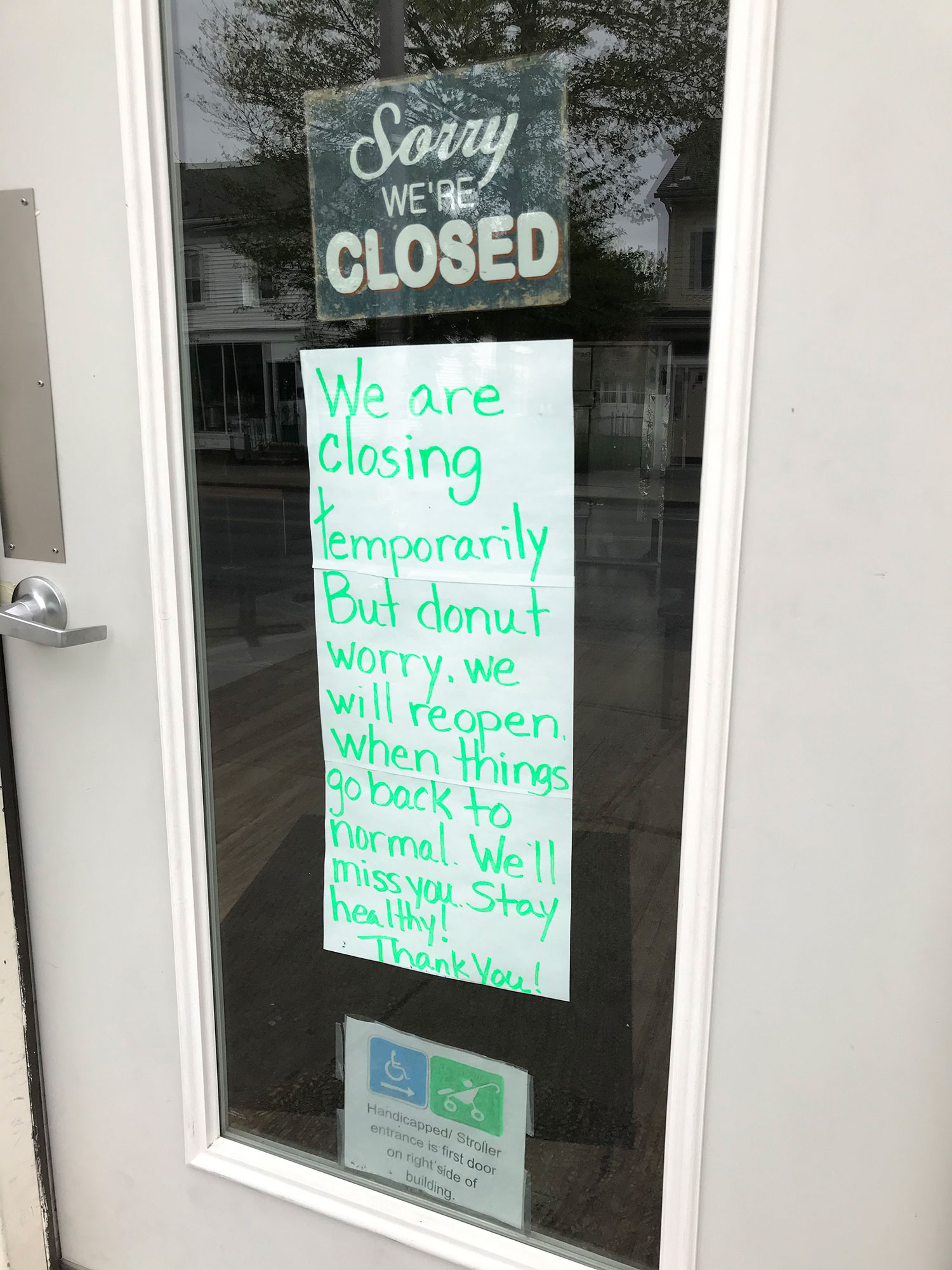
The Problem

Project Overview
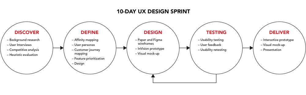
The UX/UI project (1 member) includes the following processes and methodologies. I am directly or indirectly involved in every stage of the process, including the visual design for the interactive prototype.
How might we...
At the start of the project, I had two main questions in mind.

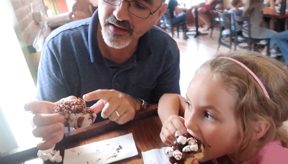
DEFINING THE GLAZED OVER DONUTS IN-STORE EXPERIENCE
• Friendly greeting as you enter the shop
• Pleasing smell of freshly fried donuts
• The shop has a warm and cozy feel
• Ordering is fast and easy, although taking the time to compare your order with friends and family is part of the fun
• Open kitchen plan allows customers to watch their donuts being created
• Customers can enjoy their donuts in the shop or order them to-go

User Research
Interviews were conducted with a group of users who have been to the Glazed Over Donuts shop, to find out their habits, needs, and pain points. The insights gathered were arranged in an affinity map before consolidating it into a user persona.
Interviews were conducted with the same group of users to find out their habits, needs, and pain points. The insights gathered were arranged in an affinity map before consolidating it into a user persona.
Sample interview questions:
• What's your favorite app?
• Why do you like that app?
• Do you use mobile apps to order food? If so, which one?
• Would you use a mobile app to order from Glazed Over Donuts, in a curbside pickup scenario?
• What features on a Glazed Over Donut app would be a priority?
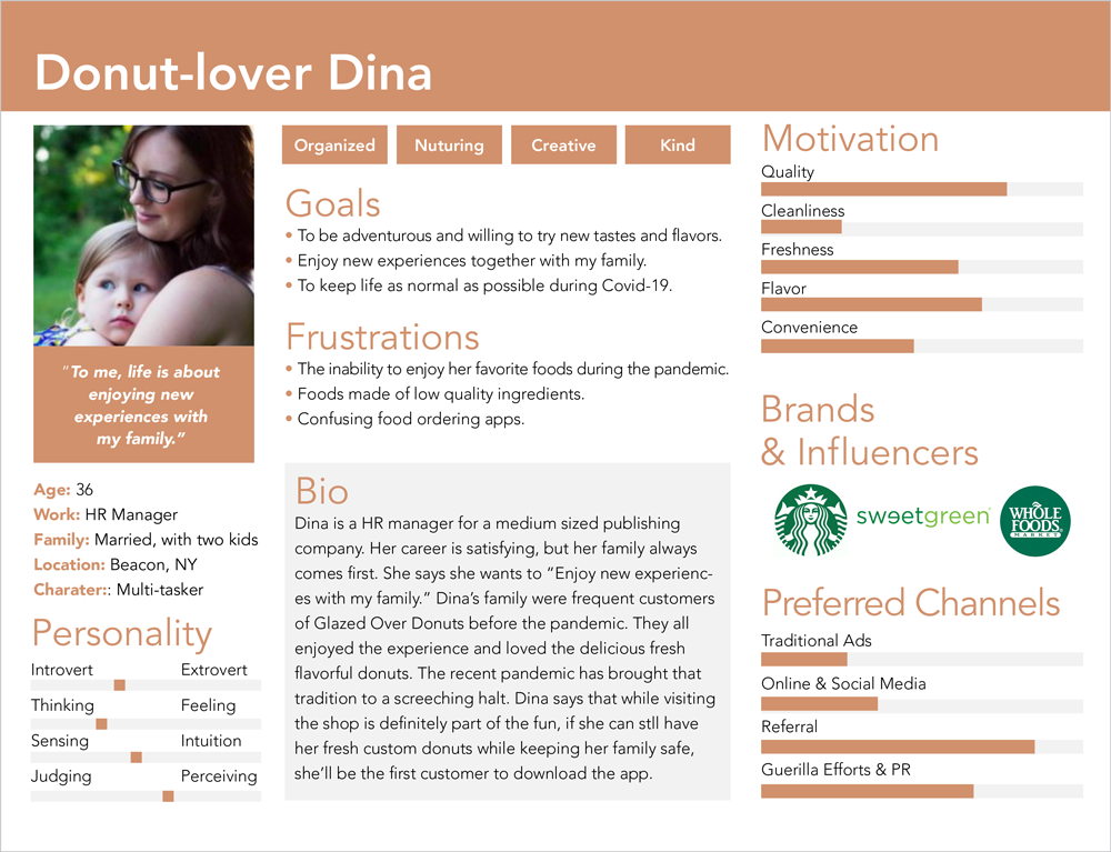
USER PERSONA
Using observations and user interviews, a user persona and a journey map were created to better help empathize with Glazed Over Donuts users and create a "user-centric" app experience.
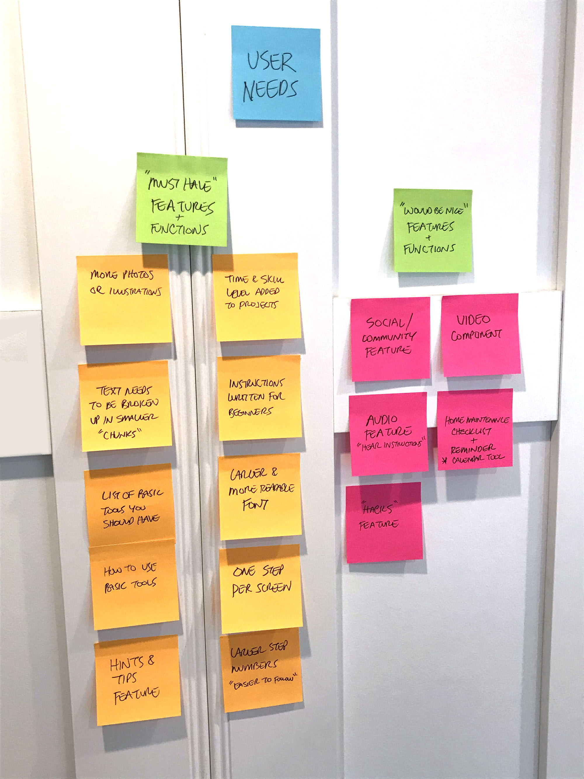
App feature priorities
Through the UX design process, we came up with various new features we intend to include in the new Glazed Over Donuts app.
These features were arranged based on feedback gathered from user interviews and what we believe fulfils business goals:
• Intuitive, fun, and friendly interface
• The ability to see how different glazes, toppings, and drizzles will look before they order
• The ability to custom order donuts without ever entering the shop
• Users can pay for donuts using mobile app
• App provides order confirmation and pickup time
• Paper, pen & pencil
• Figma
• Invision
• HTML/CSS
• Adobe Creative Suite
• Mood Boards/Competitors Research
Sketching
I began iterating by hand sketching a number of wireframe layouts and configurations.
I then begin to think about the more detailed procedure involving the custom donut creation and ordering process.
The process needed to be fast, easy, and intuitive. My approach was to walk the user through the process step-by-step. They can choose their "naked' donut, glaze, topping, and drizzle, all without ever stepping foot in the shop.
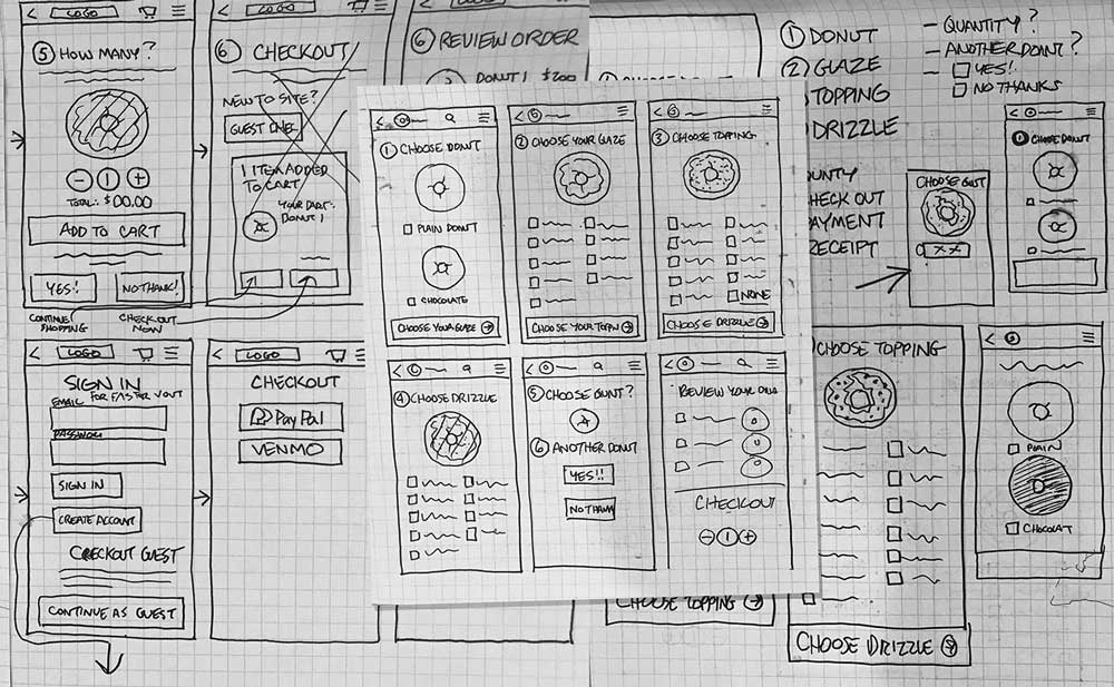
A logical user flow was developed that takes the user through the donut creation and ordering process step-by-step.

A refined and highly detailed user flow, using high-fidelity wireframes, was developed that included every step needed to complete the order.
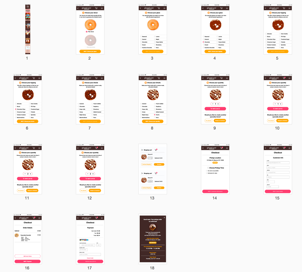
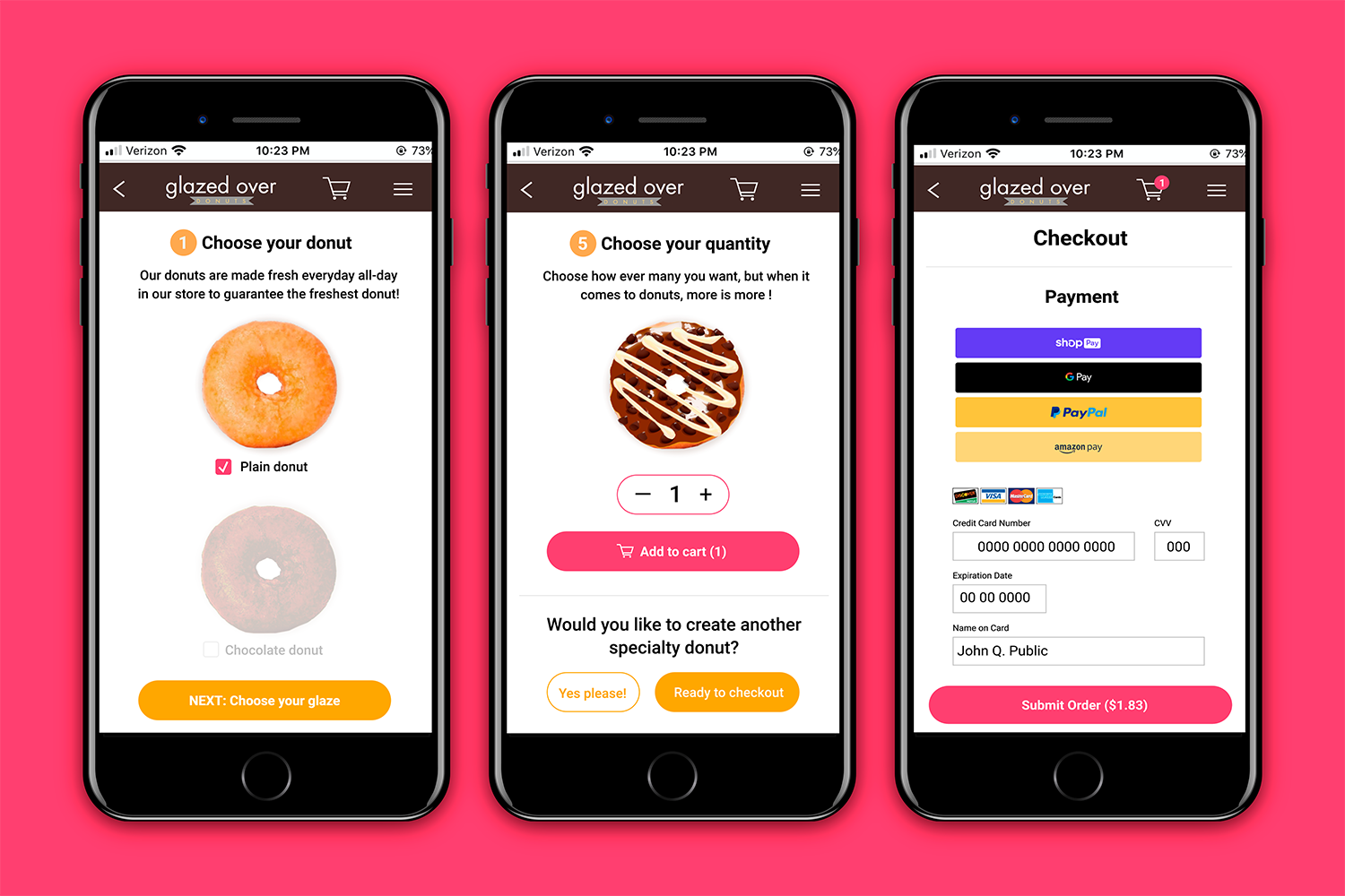
A high-fidelity prototype was built that takes a user through the donut creation process, checkout, and ultimately, order confirmation.
Tap here to try the custom donut creation process.
Validation Testing
To test the new Glazed Over Donuts app user experience, I surveyed 4 different users and asked them to perform a few predefined tasks on the app as I recorded their actions and took notes. Some of the tasks/questions were:
• Order a single custom donuts
• Order multiple custom donuts
• Order a single custom donut, then add a second donut during the checkout stage
"It was pretty easy to use. A little tricky though."
"It's confusing on the page where you choose your quantity."
"Some of the buttons need to be rearranged"
Reviewing the testing results
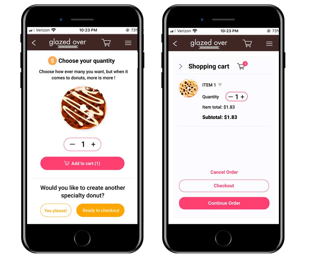
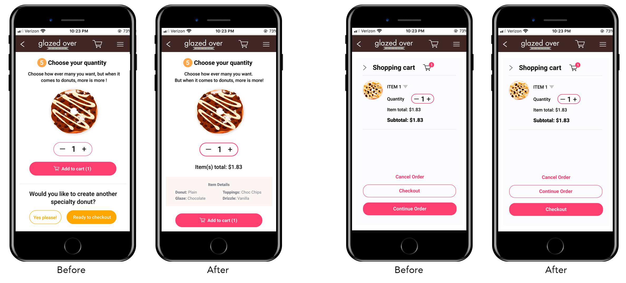
The user testing revealed a few problems with the ordering and the checkout process.• Some users were confused by the "Choose your quantity" page (see image at left). It was unclear to some whether they needed to choose the quantity before ordering additional donuts
• Some users were also confused by the buttons at the bottom of the "shopping cart" page (see image at right). Three users felt that the "Checkout" button should be at the bottom and be emphasized.
• Additional usability testing was conducted on the revised reservation process. 4 out 4 users completed the process successfully.
IDEATING and ADDITIONAL TESTING
Solutions
The buttons on the shopping cart and quantity pages (see screens above) were causing some confusion with users.
The solution for the quantity screen was to move the buttons for requesting additional donuts to a separate page. The solution for the buttons on the shopping cart page was to reorder the buttons, placing the "checkout" button at the bottom and adding emphasis to it by filling the button and dropping out the text white.
Revisions and Additional User Testing
An additional round of testing (with the same users) was conducted. This round went considerably better than the first. Here are a few of the comments:
"It's much more intuitive."
"Much better!"
"Big improvement! I wish this app were a real thing, though!"
"This app would be really useful, if and when the pandemic resurfaces."
Lessons Learned
Challenges or Obstacles
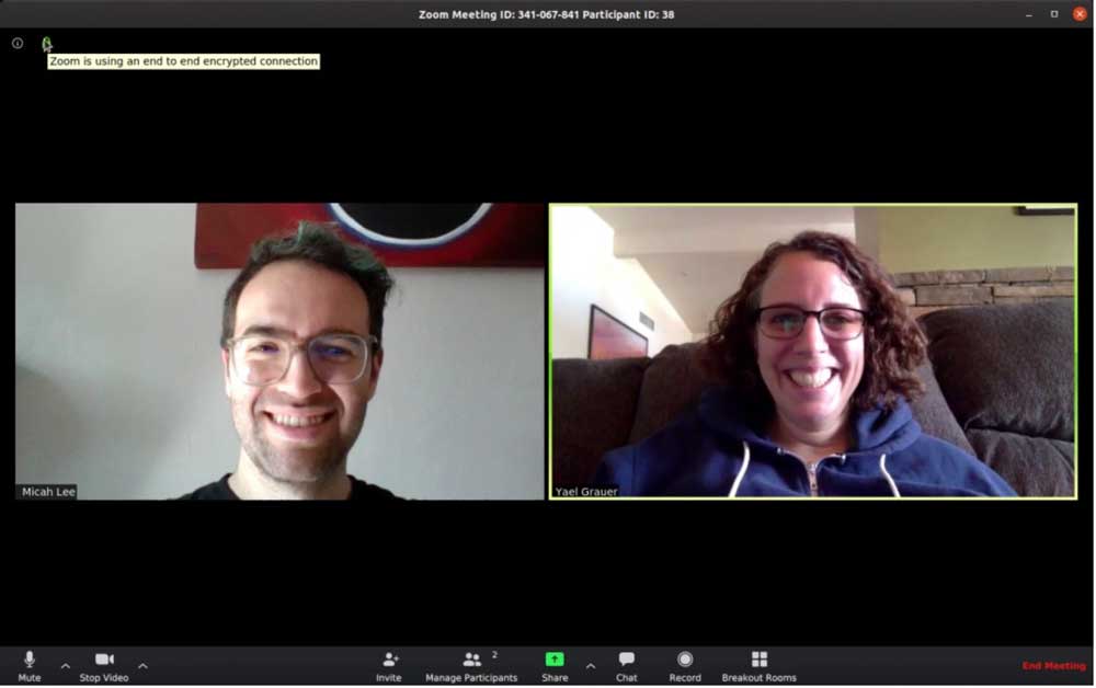
There were many challenges and obstacles during this project. The biggest were conducting user interviews and testing during a pandemic. Social distancing required conducting testing and interviews using the phone and Zoom sessions. Not being in the same room with users and getting an accurate sense of their frustrations through body language was challenging. I needed to constantly remind users to "Tell me what you're thinking as you attempt the task." I had to be sure to be extra sensitive during testing because the general anxiety level of eveyone was heightened.
The lessons I learned from this UX project included:
• User empathy is critical in any UX design project. User empathy during a pandemic is paramount
• Just becasue you're the UX professional, doesn't mean you can't learn from or listen to user's ideas
• No matter how well the first round of testing goes, a second round can only improve the user experience